Over the last few lessons, I have been creating my album cover and magazine advert.
Before coming up with my final idea I came up with three different album covers as I wanted to make sure it was as successful as it could have been. In this case I wanted to make sure the colours I used were suitable and that they worked together as well as making sure the images I had selected worked well as a cover.
 |
| My album cover. |
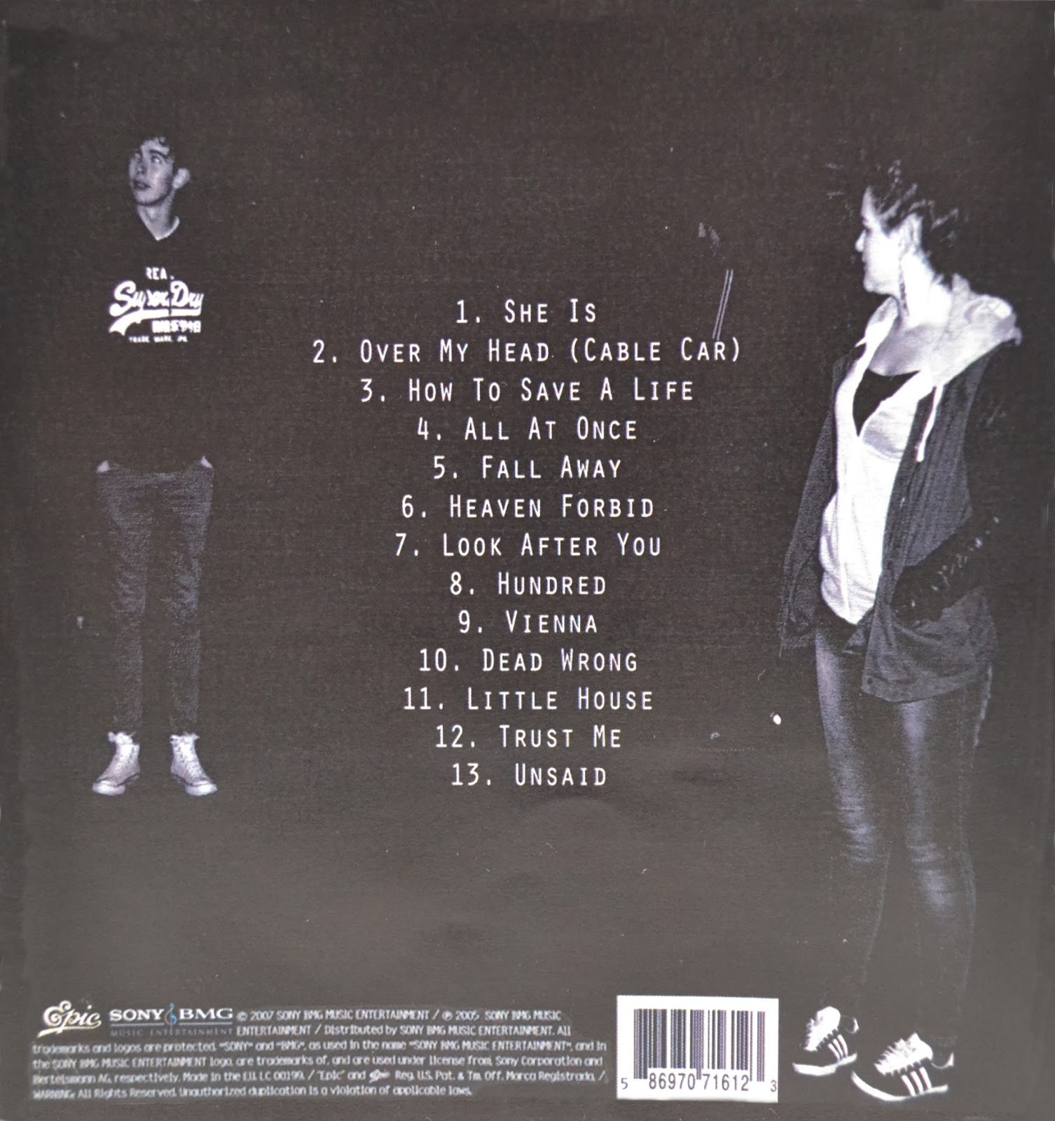
For the back cover I then chose an image that showed Max, Chloe and Jack to be positioned at the opening of the alley. Here Jack was stood leaning up the wall out of the way, whilst Max and Chloe were in the foreground of the image. When editing this image I made it black and white and then added a filter layer to it which enabled me to add grain to it. At first I had only put the bar code on the image and had it centralised on the page. Then realising I had more to add if I wanted to follow the codes and conventions, I added the track list for the album which you will see in the middle of the image and I later added the record label and copyright information to the back.
For the third image, I used another photograph that I had taken with a slow shutter speed, but changed this to black and white. I then copied the lyrics to the song and pasted them on the left hand side of the image. This was then accompanied by screen shots from my video which I have placed on the bottom right hand side of the image, showing both Chloe and Max.

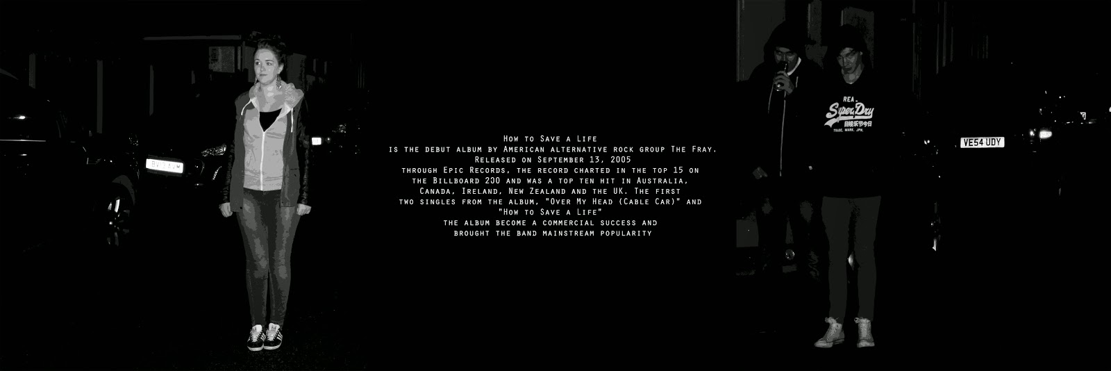
For the inside of my album cover, I decided to stick with the black and white colour scheme as I think the images I have chosen to use look more effective. When deciding on what images to use, I looked at using screen shots from my video however they were blurred and didn't work well together. From the image below you will see that I have used two images and a piece of text with a plain background. One of the images shows Chloe to be stood to the right, looking off to the left and the other shows Jack and Max. The text I have used here is information on the album which again I think has been quite effective as I am giving the audience more of a background story to the album, which if released would be interesting for a fan.
I then went through a similar process when deciding what photos to use for my magazine advertisement but in the end I wanted to make sure the images I used were familiar but at the same time effective. When creating the advert, I joined the image of both Chloe and the boys together. I then added a layer to both of the images and this allowed me to posterize the image. When looking at the text you will see that I have included a quote from Rolling Stone Magazine and the name of the album and band. I have also added the price of the album which can be found underneath the album cover image. In the top left corner I have also included the iTunes logo as this is where the album is available from and in the bottom right hand corner I have added an image of the album so that my target audience knows what it would look like.

No comments:
Post a Comment